B2C App for LegalZoom
A first-ever B2C app for LegalZoom, extending their Estate Planning offering to mobile platforms. Customers tracked their estate plan completion, booked consultations, stored files online, and shared them with loved ones.
MY Role in 2016
Senior UX Designer responsible for designing key user flows and prototypes, validating designs through usability testing, and collaborating with product managers and developers throughout the sprint cycles.
OUR Team
2 UX Designers (iOS & Android)
2 UI Designers (iOS & Android)
1 Product Director/Manager
2 Developers (Android)
2 Developers (iOS)
1 Copywriter
QA
OUR TIMELINE
8 months
OUR SITUATION
It was 2015 and LegalZoom - a company offering legal advice and docs online - was excited to finally enter the mobile app space by offering its first B2C mobile app for iOS and Android. It was decided that since they already offered a desktop application for customers making estate plans, we’d create a feature-rich estate planning app on Android and iOS for digital estate plans available on the go.
MY TASK
As Senior UX designer, I led the UX design and strategy from end-to-end that would:
Take over the project that was started by another UX designer who left before I arrived.
Create Android UX assets: sketches, wireframes, flowcharts, screen flows, and prototypes as needed to support development.
Collaborate with the product owner to bring LegalZoom leadership’s vision to reality.
Partner with a visual designer who created comps while I created UX assets.
Perform UX Audit of the built app to ensure design adherence.
Launch the MVP of the app within agressive timelines of 8 months from start to launch.
MY ACTIONS
1. AN ABANDONED PROJECT
Another UX designer started the job but left after a month. I took over his work, which was a single page of conceptual screens in Sketch.
2. DON’T THINK, JUST start
I was new and the schedule wouldn’t allow the team to do discovery, research, or requirements so my challenge was to start designing based on assumptions. Much remained to figure out on an aggressive schedule. Using Squid on my tablet, I started by sketching ideas and shared them during team brainstorm sessions.
3. CLICKABLE FLOWCHARTS
One of the key features let users book consultations with attorneys or tax advisors. To show where these flows overlapped, and make it quick and easy to revise and keep current, I made clickable flowcharts.
4. COMPLEX FILE STORAGE
Cloud storage would store user files and docs with back end services from BOX. Without an out-of-the-box front-end solution, so had to design our own.
As we progressed, I learned that flowcharts were hard for the team to follow, so I produced more screen flows instead of flowcharts.
5. TRANSITIONS AND ANIMATIONS
Our Product Director was unfamiliar with Android. I prototyped my ideas for the interaction model, which allowed us to test how they felt before developing them.
To make it easier to demo and share links with the team - I used Axure in desktop browser view instead of mobile, which would require special setups to view.
A user can add and edit family members, check status of their documents, and clear notifications.
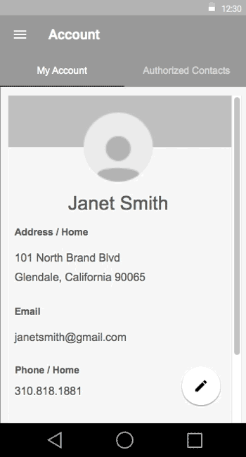
A user can edit, delete, or add a new Authorized Contact from this screen.
6. TONS OF FEATURES
The app contained 12 sections and by the end I produced up to ~200 pages of wireframes, screenflows, and flowcharts in Axure.
7. USER ACCEPTANCE TESTING (UAT)
During the final states of the build, I audited the UX and gave screenshot notes to the Product Director, to prioritize bugs and defects.
THE RESULT
There were some bumps along the way, and it was a great learning experience for all while launching the app on time under the aggressive design and development timeline.
Shareholders were pleased by notable increases in:
Market Expansion / New Revenue Channels: The launch of the app unlocked a new mobile channel, enabling us to reach on-the-go users and small business owners previously underserved.
NPS / Brand Perception: By launching a modern, intuitive mobile app, we elevated LegalZoom’s perception as tech-forward and accessible. Shareholders and customers were impressed by the app’s on-the-go features for booking attorney and tax consultations, while accessing their estate planning documents from their pocket.
Operational Efficiency / Cost Savings: The app streamlined booking attorney and tax consultations that previously required customer service intervention, reducing call center volume and increasing self-service success.
Customer Retention / Engagement: App engagement led to higher retention rates, with mobile users exhibiting stronger loyalty behaviors like more frequent logins or repeat usage to view or track completion of their estate planning documents.
Above: All final comps by Ade Nurasih, visual designer.
MY TAKEAWAY
Every project has its own challenges, and we all learned valuable lessons for next time. My takeways and learnings included:
An app designed without research to identify the user problems/needs will face challenges.
In addition to an intuitive front-end, proper back end-database integration will greatly improve the user experience. Users reviewing the app complained it did not recognize their existing accounts, and they had to re-enter information.
I further mastered my skills in Axure.
How and where to simplify documentation and annotation for the product and development team.