Reducing Errors and Support Calls for 16M+ Users Across ADP's Mission-Critical Timecard Platform
For 2.5 years as the sole Lead UX Designer, I owned UX across 23 initiatives on ADP's Workforce Now Timecard — a compliance-critical time-tracking tool used by 16M+ employees globally.
I streamlined time entry patterns to reduce errors and support calls at scale.
TLDR Overview
Role: Lead UX Designer
Team: 1 Backend Product Owner (remote), 1 Frontend Product Owner (remote), 3 Developers, 1 Content Designer (remote)
Timeline: Resumed and completed within ~2 months after paused 2 years due to shifting priorities
Challenge: Redesign ADP’s Timecard tool in Workforce Now to improve usability, accuracy, and consistency across desktop and mobile. The legacy tool created friction for employees and managers, leading to frequent errors and support tickets.
Focus Areas: UX QA, Task flows, error handling, collaborating across product and engineering
Impact
Improved user clarity and trust through progressive data-loading, reflected in HEART metrics improvements in Happiness and Task Success.
Simplified time entry, reduced task errors
Aligned the experience with ADP’s OneUX system, improving Adoption across enterprise clients.
Above: Video (also shown in the Result section farther down) walks through the before and after for the design improvements. It shows a user quickly adding and deleting multiple time entries.
My Task
As Lead UX Designer, I aimed to propose minimally disruptive UX improvements that would:
Boost employee confidence and efficiency
Reduce time entry errors and support tickets
Improve accessibility (WCAG 2.1 AA)
Balance backend constraints with user needs
Align UI with the Workforce Now design system
Improve Happiness & Task Success (HEART framework)
While tools like Pendo and Google Analytics were available, the org rarely prioritized UX metrics or benchmarking. I advocated for defining success early, but often relied on stakeholder feedback, usability insights, and edge-case reviews to guide iteration.
I knew what we should be measuring, but in a culture without metrics, I focused on what I could impact: clarity, usability, and cross-team alignment. In a more metrics-driven org, I would have benchmarked the current state, tracked HEART-aligned behaviors post-launch, and shared insights to refine future designs and patterns.
Our Situation
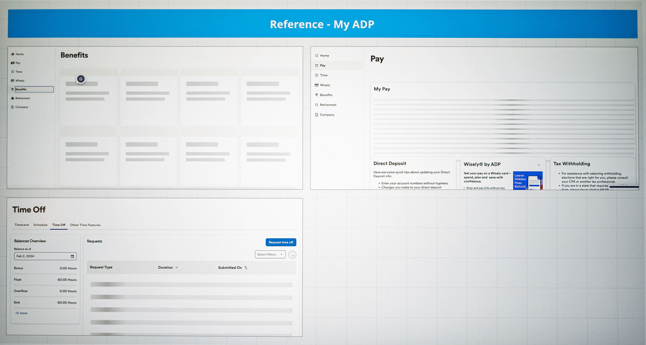
ADP’s Timecard interface was a core feature of the Workforce Now platform used daily by employees to track hours, request time off, and submit time for payroll processing. Despite widespread usage, parts of the experience were outdated, unintuitive, and frequently criticized by users.
ADP account managers received repeated feedback from clients that the timecard:
“Felt clunky”
“Was too easy to make mistakes on”
“Took too long to fill out”
Internally, product owners and support teams surfaced several issues:
Time submission errors were frequent and costly
Users found the interface unresponsive and unreliable
Managers were spending too much time correcting employee timecards
Meanwhile, ADP had released a new backend engine with capabilities that didn’t exist when the original Timecard was built. The team was tasked with improving the experience without disrupting mission-critical payroll workflows.
Below: flow shows an ideal solution we began in 2022, which was paused for two years.
My Actions
Whenever possible, I prefer to start by reviewing direct user feedback or conducting interviews across industries (hospitality, retail, manufacturing, etc.) to identify the top four to five pain points that will drive design priorities.
However, to control client relationships and protect their time, ADP only allows interaction with client users through their UX Researchers. In this case we had none available to us, so without access to end users or research data, I took a different approach.
Step 1: Reverse-Engineer the Problem
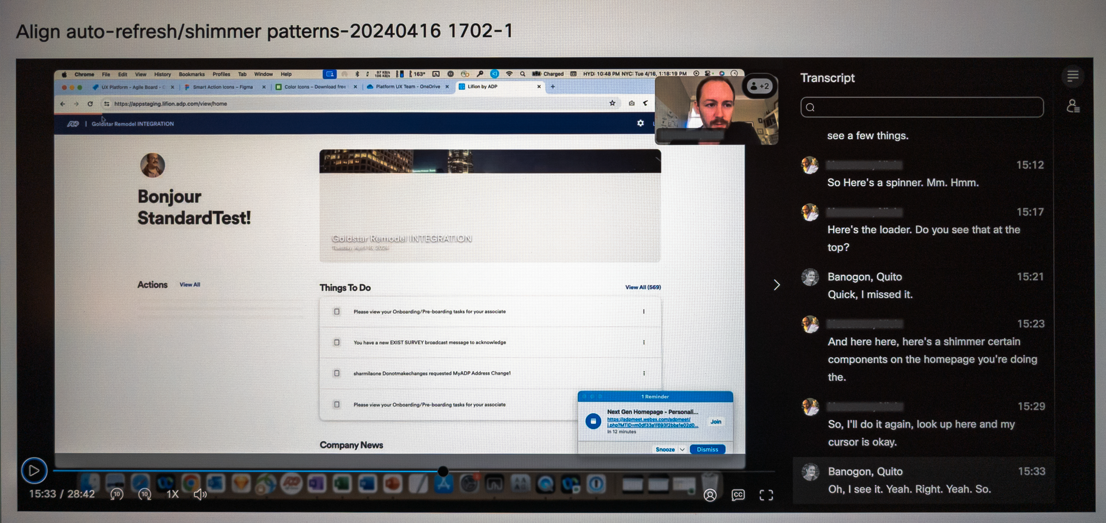
I walked through the entire employee flow of adding and deleting time entries. I recorded the session, then analyzed frame-by-frame how the system responded to input. From this, I created a detailed 11-step screen flow that mapped system behavior at each step. This analysis laid the foundation for cross-team discussions and prioritized UX breakdowns.
Key issues included:
Misused or hard-to-see busy indicators
Full-page lockouts that felt like screen freezes
Incomplete data refresh
Redundant reloads and reliance on a manual “Reload” button
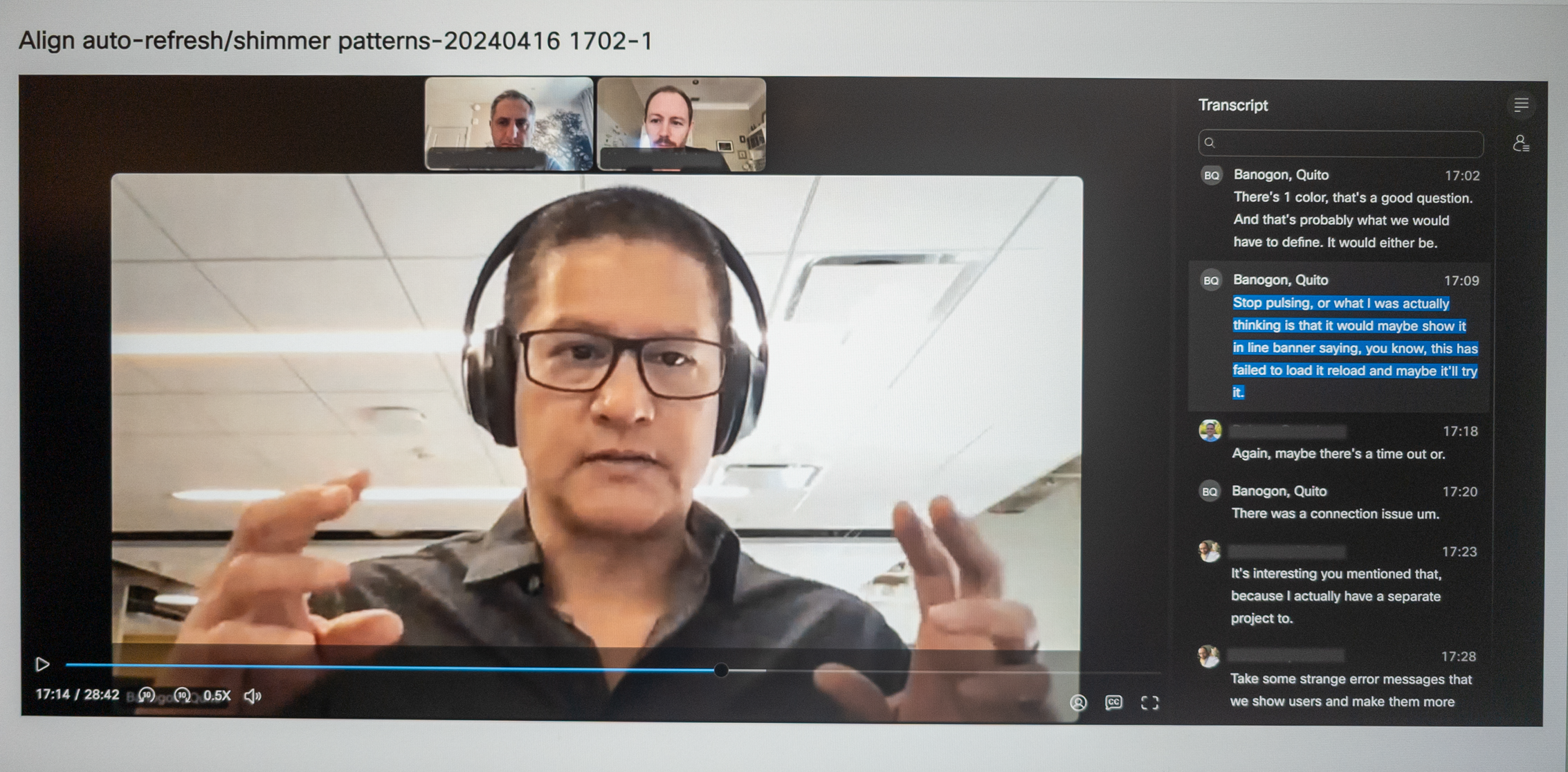
Below: video showing the problematic 11-step flow for a user creating and deleting a time entry.
….originally implemented as a workaround for an outdated backend engine. With the new backend engine ready, we could finally eliminate it but we had to design how.
The “Reload” button was a known issue…
Below: A major pain point I identified was the button to manually reload the screen so that it could download fresh backend data.
Step 2: Collaborate Cross-Teams
Developers noted that partial data loads would still occur due to backend limitations. They had tried implementing loading states, but there was no standard across the product. I suspected this was common in large, siloed organizations like ADP, so I collaborated with other ADP UX teams to understand how they handled similar challenges. While patterns varied, we aligned on a shared insight: deviating from existing norms was justifiable if it meant establishing a stronger, more effective precedent.
Step 3: Compare Industry Patterns
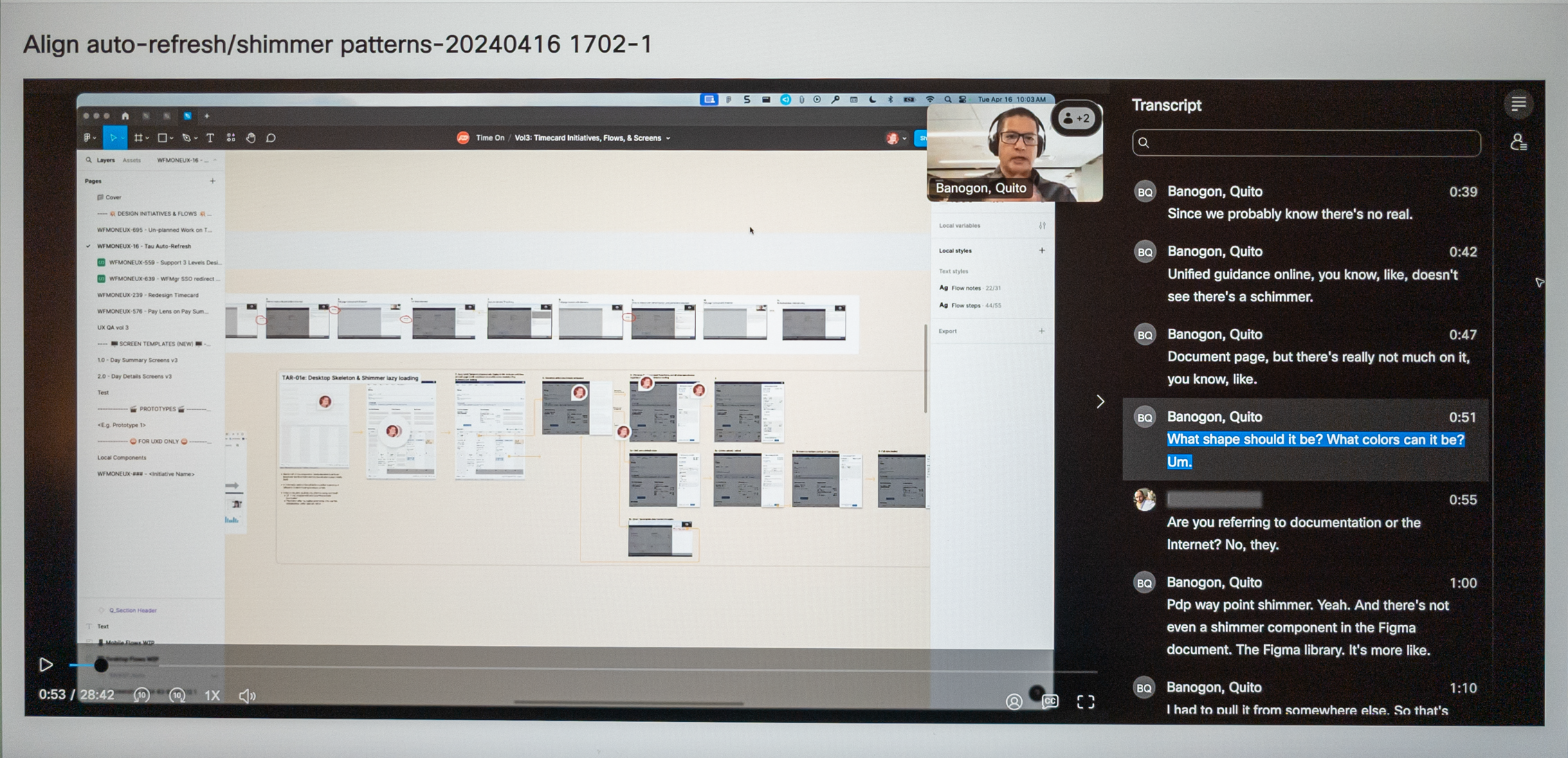
ADP’s design system, Waypoint, was still being developed and lacked a clear standard for handling screen loading states using its partially defined “Shimmer” pattern.
Below: ADP’s Shimmer loading pattern only contained an Overview description and example visual. Lacking were interaction rules, A11y guidelines, and when and how to use the Shimmer.
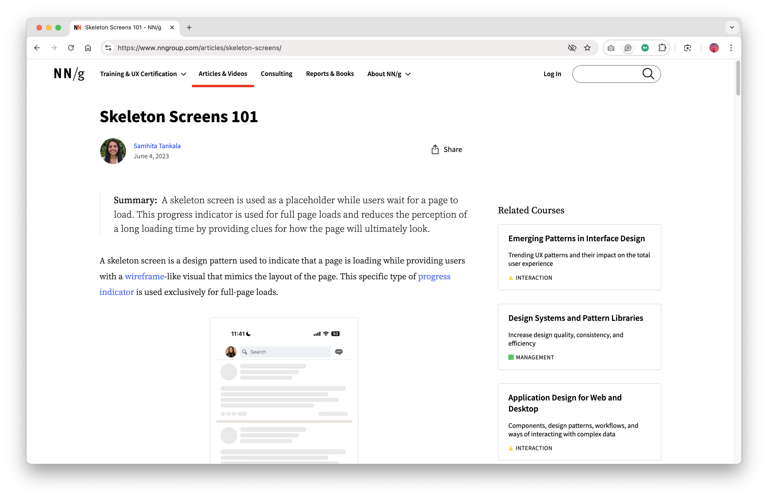
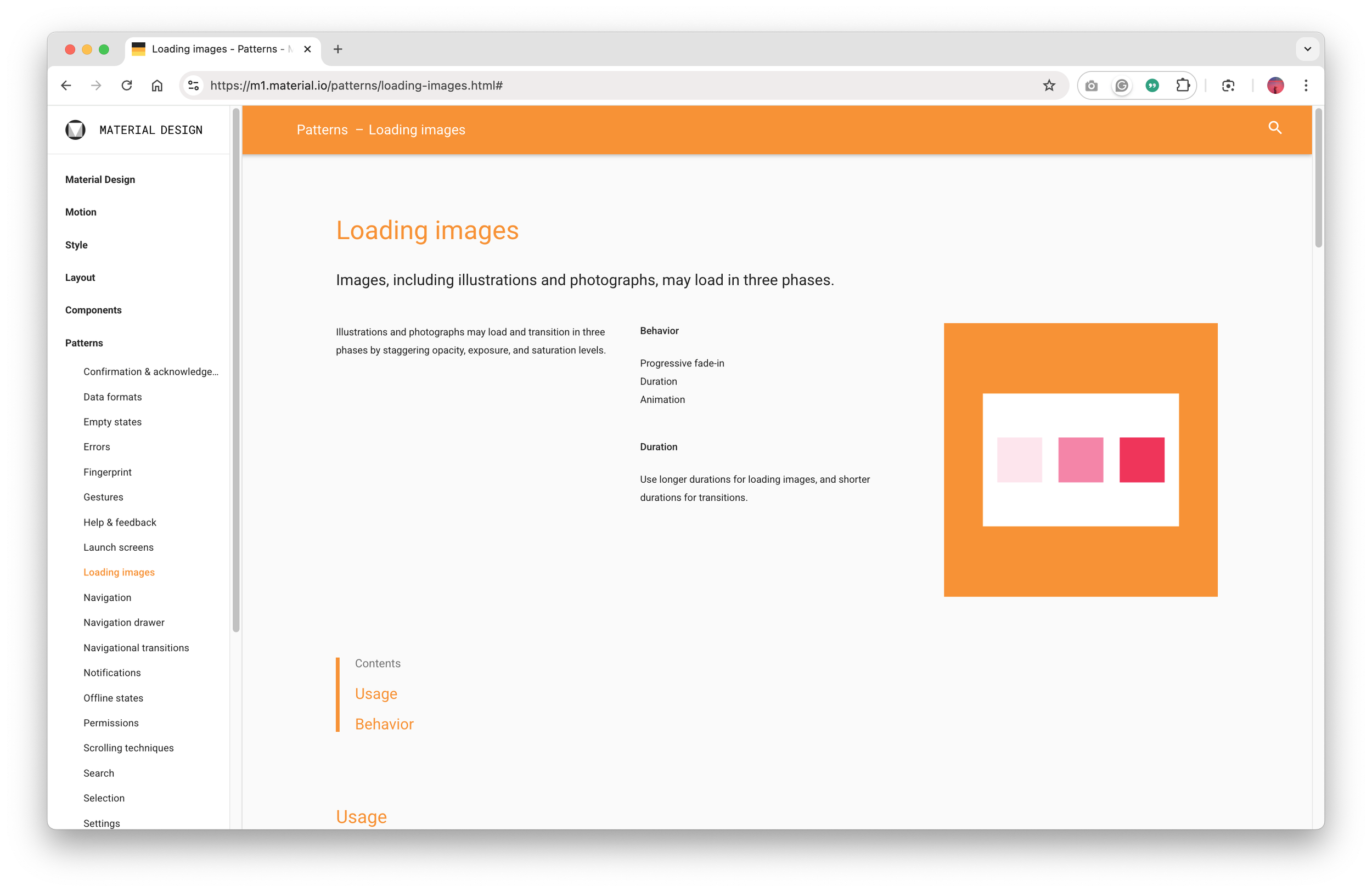
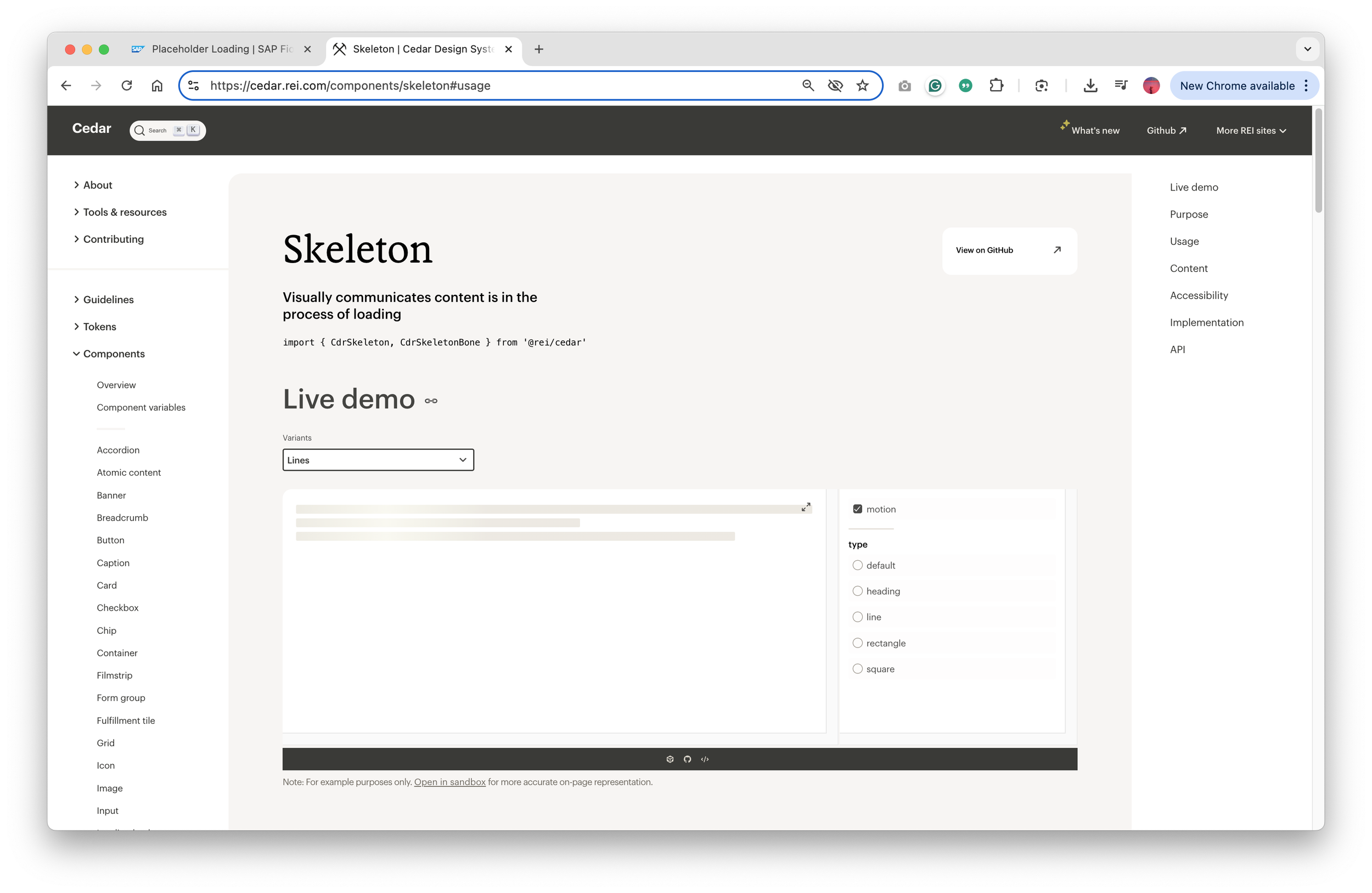
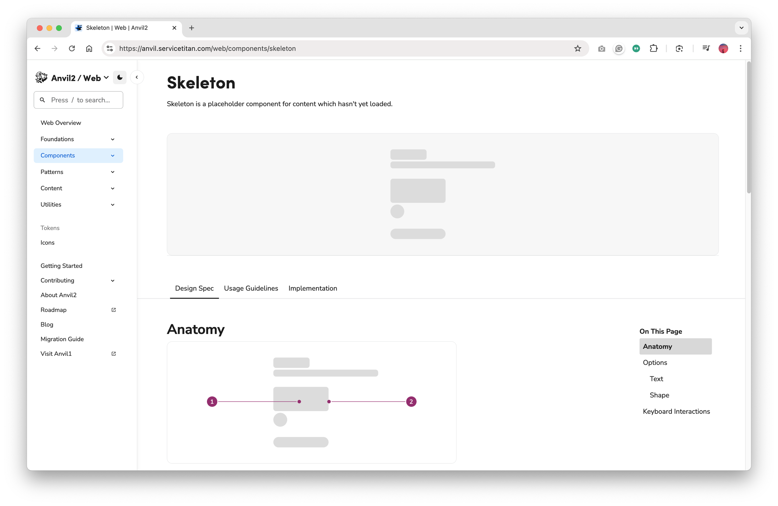
To guide our approach, I researched external systems:
NN/g
Google’s Material Design
REI’s Cedar
ServiceTitan’s Anvil
SAP’s Fiori
Below: SAP’s model stood out by allowing users to stay productive while data loaded progressively, which closely aligned with our users’ mental models and real-world expectations.
Step 4: Collaborate with Development
I partnered with backend and frontend devs to map error and loading states throughout the system. This clarified what was technically feasible and revealed areas where better UX could support asynchronous backend behavior.
Below: A portion of the matrix we created and shared to clarify the various error scenarios, with current and updated messages.
Step 5: Iterate with Development and Product Teams
Starting with the current happy path, I explored multiple UI flow variations using shimmer loading patterns, spinners, and progressive disclosure. I collaborated closely with product, engineering, and content to iterate toward a solution that balanced user clarity with technical feasibility.
Below: the original Happy Path solution that required the “Reload” button to load missing data.
Below: An expanded flow showing modules progressively loading data using the Spinner pattern. When designs were superseded, I marked them in red but retained them for easy reference during future discussions.
Below: Another expanded flow to show module progressively loading data using the Shimmer pattern with less granular ability. When designs were superseded, I marked them in red but retained them for easy reference during future discussions.
Below: The final design solution as settled upon by the team. Now I just had to address all the various user scenarios.
Step 6: Handoff Collaborative UX Deliverable to Development
We removed the “Reload” button entirely. Instead, data now loads progressively within modules using the Shimmer pattern, paired with simplified banner messages that clearly communicate system activity.
To meet WCAG 2.1 Guideline 2.3– Seizures and Physical Reactions, we ensured Shimmer animations did not exceed five seconds. When longer loads were necessary, the Shimmer transitioned to a static state to prevent motion-triggered discomfort.
For dev handoff, I created a simplified flowchart illustrating the interaction logic, followed by detailed screen flows showing UI behavior across success, error, and loading states. Those deliverables became the team’s shared blueprint for implementation.
Below: Rebuilt version of the flowchart that communicates the data flow and UI behavior.
Below: The video walks through designs of the above Figma screen flow deliverable, which includes edge cases for development.
The Result
We introduced a unified interaction pattern that replaced the clunky “Reload” workflow with a seamless, progressive data-loading experience. By aligning backend behavior with user expectations, the redesign improved clarity and trust across the entire timecard workflow.
While ADP didn’t have a strong culture for tracking UX metrics, qualitative feedback from product, QA, and development highlighted clear improvements in two HEART framework areas:
Task Success: Users no longer had to second-guess whether changes were saved
User Happiness: The interface now feels more responsive and intuitive, which likely reduced frustration and made the workflow feel smoother.
With those changes, we could confidently say:
User actions are acknowledged immediately
Partial loads are handled visually and intuitively
The overall experience feels faster, more modern, and more polished
Below: Same video as shown at the beginning of this case study. It shows the before and after final production build, with a user quickly adding and deleting multiple time entries.
My Takeaway
Balancing backend constraints with user trust is one of the biggest challenges in enterprise UX, and it’s something I’ve learned to navigate across multiple ADP initiatives.
This project reinforced a few key lessons:
Involve UX early: UX should be involved from the start even when the interaction seems “obvious”.
Don’t forget edge cases: Designing for real system behavior and failure states is just as critical as optimizing ideal flows.
Break rules when justified: It’s okay to break with design consistency when doing so creates a clearer, more scalable path forward for users and the business.
Ultimately, small UX details like how a system handles loading or feedback can make a big difference in how confident and in control users feel. I’ve learned to treat those “invisible” moments like Shimmer loading behaviors with the same care as the main workflows.