Driving Engagement Through UX Redesign of a 100K+ User Compliance Platform
ADP's Compliance On Demand platform gave 100K+ HR clients access to legal guidance and expert consultations, but a hard-coded legacy experience made it harder for users to quickly find answers and book help.
I led the UX redesign, aligning the platform to ADP's new design system and broader ecosystem goals while coordinating a fully distributed team across a 13-hour time zone gap.
BEFORE
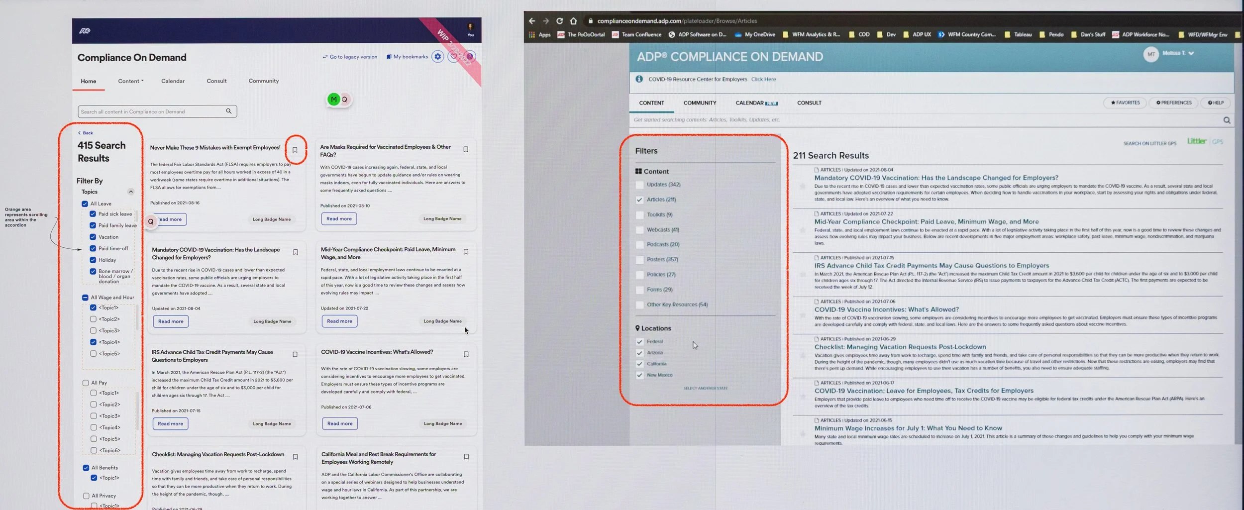
Legacy Compliance On Demand homepage. All hard coded, no design system components, complex and dense information. Low engagement and took time to find valuable content.
AFTER
New Compliance On Demand homepage. Used ADP’s new design system components with simplified UI increased engagement and reduced time needed to find valuable content.
ADP posted this video of the finished product on YouTube to boost awareness and adoption.
TLDR Overview
Role: Lead UX Designer
Team: 1 Product Manager, 3 Developers, 1 Content Designer
Timeline: 1 year, phased delivery across releases
Challenge: Redesign Compliance on Demand to migrate to a new CMS, align with ADP’s OneUX system, and create cohesion with Workforce Now.
Focus Areas: Information architecture, workflows, prototypes, cross-team workshops
Impact
Modernized COD with CMS migration and OneUX alignment, improving Engagement, Time on Task, navigation and usability for HR teams. The redesign increased confidence in compliance readiness and positioned the product for stronger sales adoption.
Measured over 3 months:
Traffic to community site: Clicks grew from 46 (legacy) to 112 (new) = 143.5% increase
Traffic to Littler site: Clicks grew from 16 (legacy) to 58 (new) =262.5% increase
Number of Consultations: Grew from 50 (legacy) to 90 (new) =80.0% increase
Total Visitors: Grew from 554 (legacy) to 854 (new) =54.2% increase
Total time on site: Seconds reduced from 172 (legacy) to 149 (new) = 13.4% decrease*
*Decrease is better, because it means the HR Practitioner retrieved information quicker, freeing them to do other things.
My Task
As Lead UX Designer my tasks for COD were to:
Redesign the existing COD to use the early-stage OneUX design system.
Improve usability where needed.
Leverage the new tech stack that used a new navigation shell to frame the COD website content.
Apply the HEART framework to track improvements in Happiness, Engagement, and Time on Task.
Lead the end-to-end UX delivery of the MVP while coordinating with a product owner based on the East Coast and a development team in India.
Our Situation
ADP included Compliance On Demand (COD) as a resource tool with their Workforce Management (WFM) subscription. There was already an existing website for COD where users could find content, but the site was dated. The existing site was also hard-coded and couldn’t leverage ADP’s upcoming “OneUX” design system still in development.
Simultaneously, ADP was updating their current offering called Workforce Now (WFN) with a broad set of new features, and that would also adopt the new OneUXD design system.
Therefore, the redesign aimed to::
Migrate to a new CMS and adopt the new OneUX design system to streamline and simplify future updates.
Match the visual style to WFN and increase brand cohesion.
Modernize COD to improve marketability when bundled with WFN and increase sales conversion.
Update the code to the new tech stack so it aligned with the rest of ADP’s upcoming products
My Actions
We had no prior data or user researchers to identify pain points or areas of improvement, and stakeholders only shared anecdotal feedback that the site felt outdated and difficult to navigate. Given these constraints, I relied on heuristic principles throughout to guide design decisions.
Note: The screenshots in this use case are blurry because I took photos of the screen when I lacked access to the original ADP files.
Step 1: Establish Weekly Cadence
Since I was the only team member on the west coast, the product owner was on the east coast, and the development team in India, I knew collaboration would be a challenge. I met the product owner to gather whatever requirements she had and I established weekly UX reviews for me to share progress and information. We also met every other day for triad stand-ups to keep us moving forward each week.
Below: A work session with the product owner located on the east coast, who patiently and thoroughly walked me through the intricate details of the existing site that requires a comprehensive redesign.
Step 2: Evaluate the Current Site
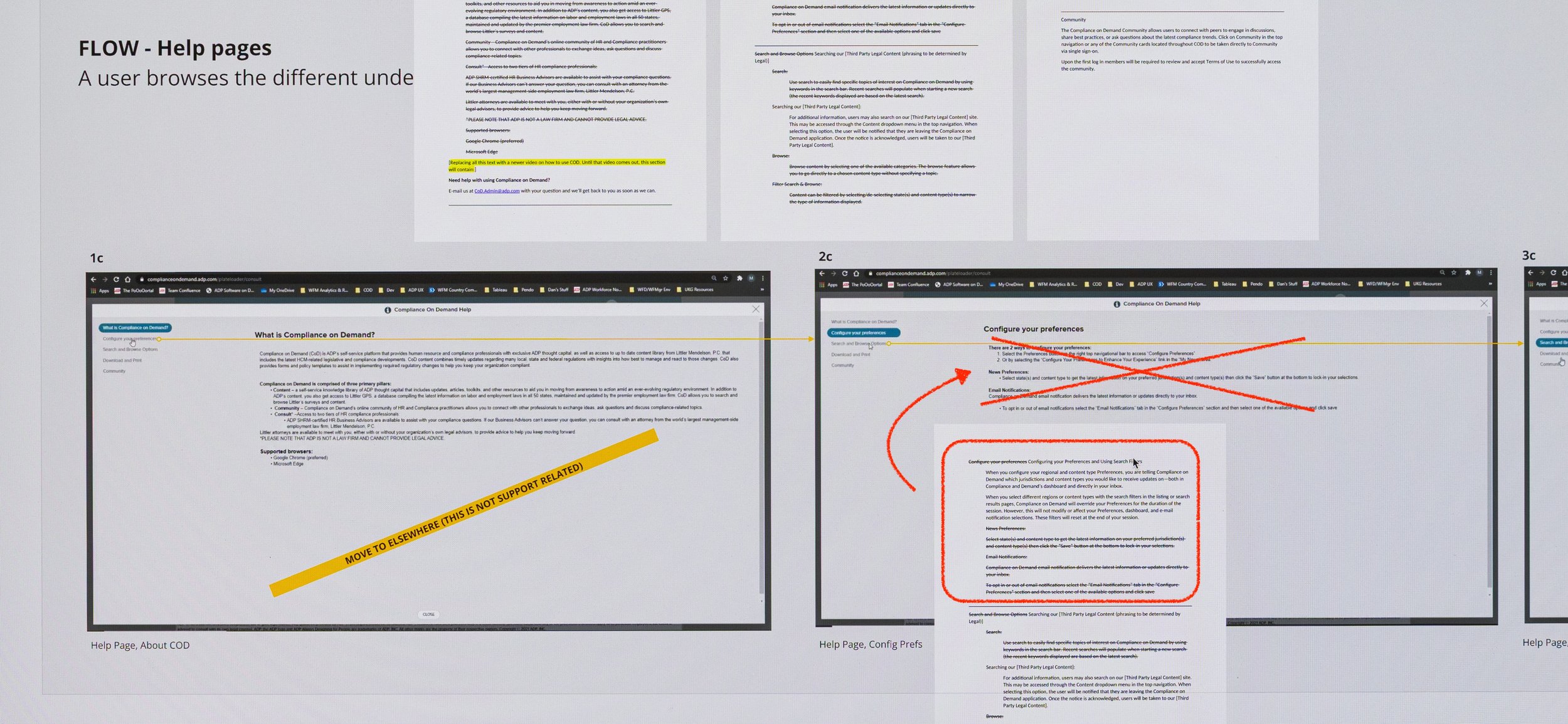
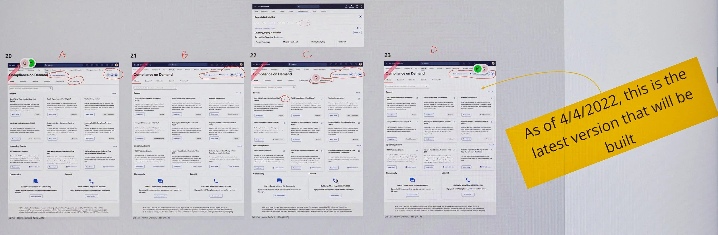
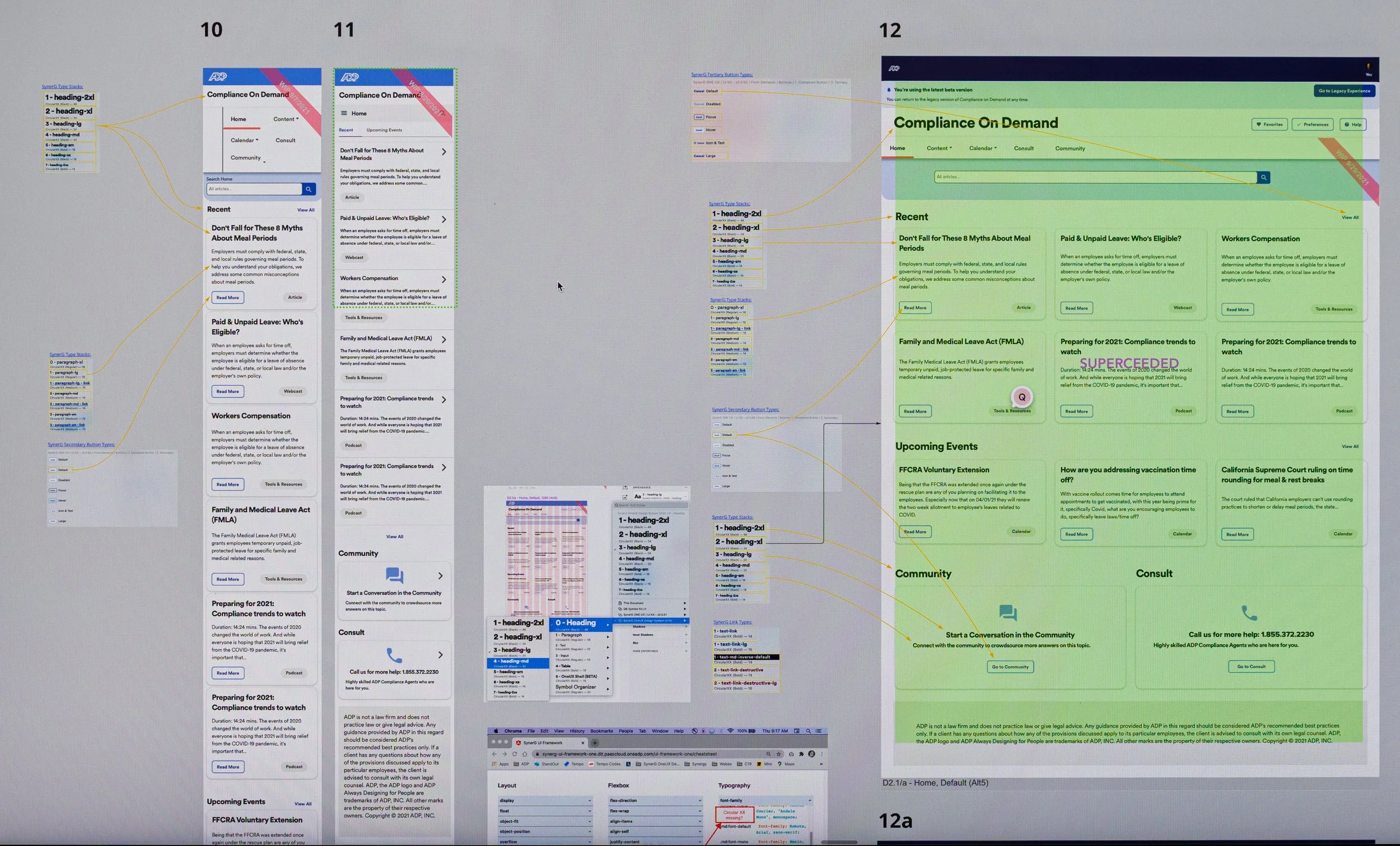
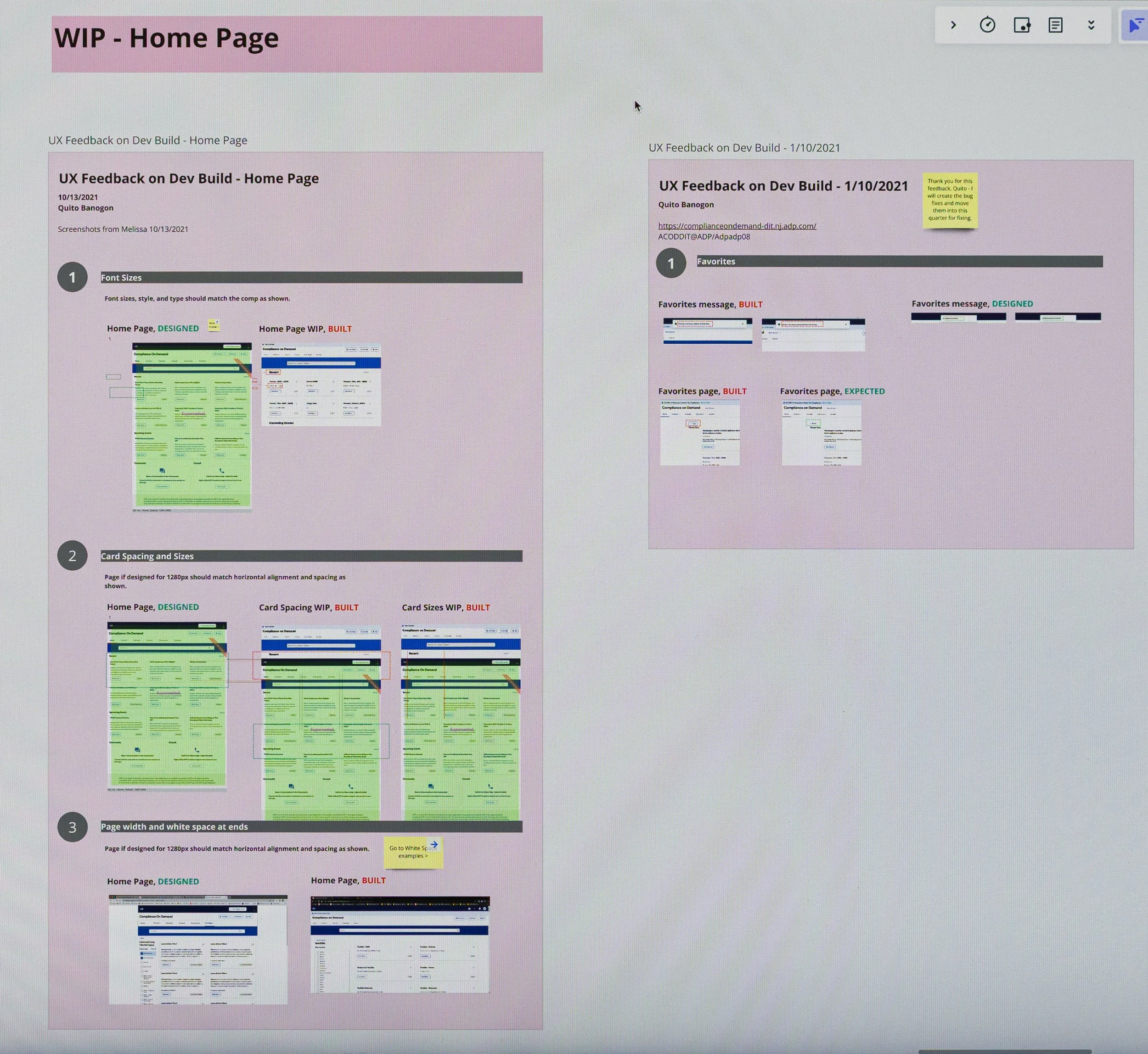
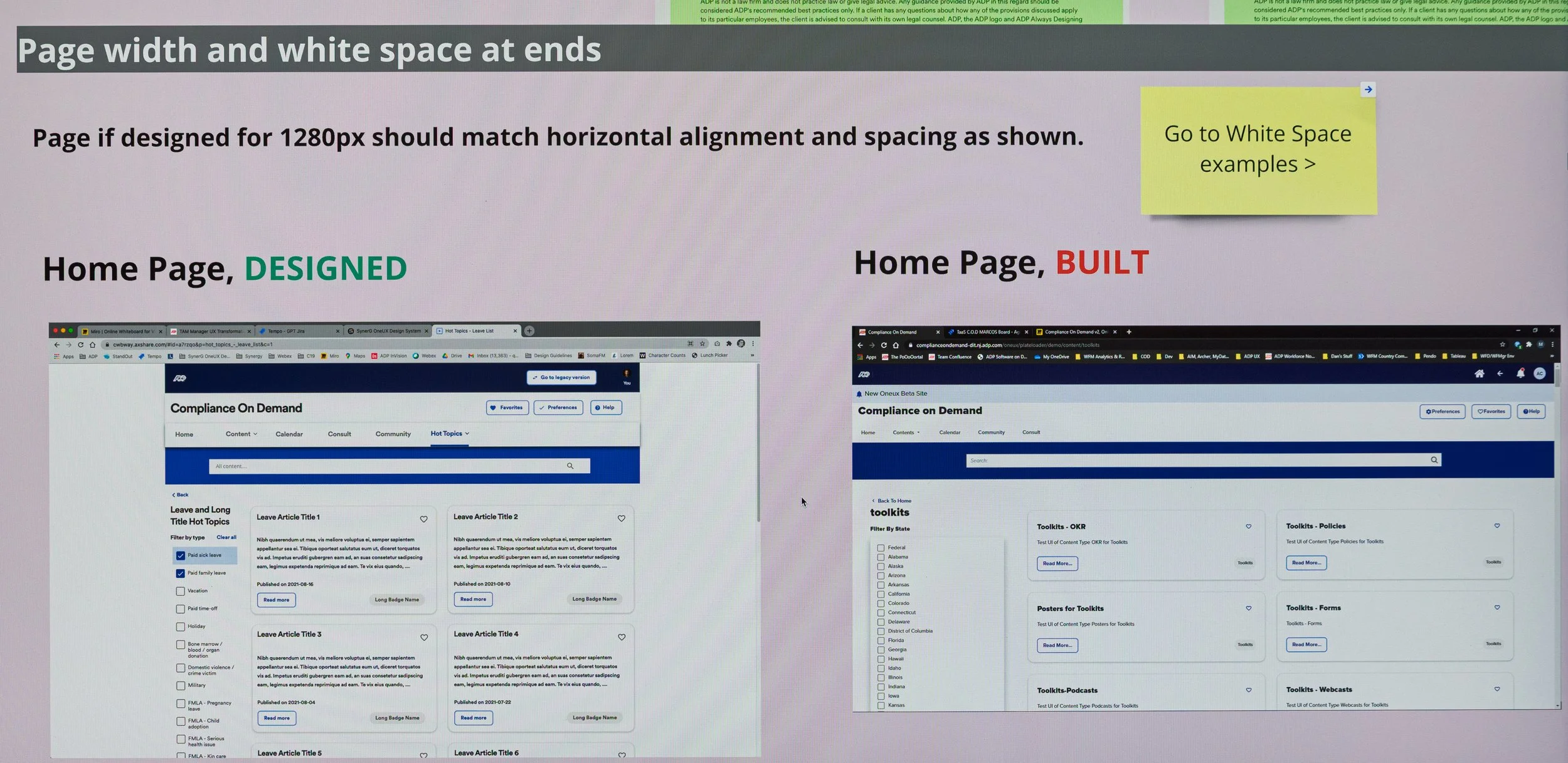
Relying on UX heuristics to guide design decisions, I evaluated the current site, section by section, page by page. Using screenshots of the current site, I mapped them into screen flows to serve as a starting point for discussions with the product team on what we should tackle first and how.
Below: This is just an example of the screen flows of the current experience that I have laid out by sections, to review with Product and Development and agree on the scope for each phase.
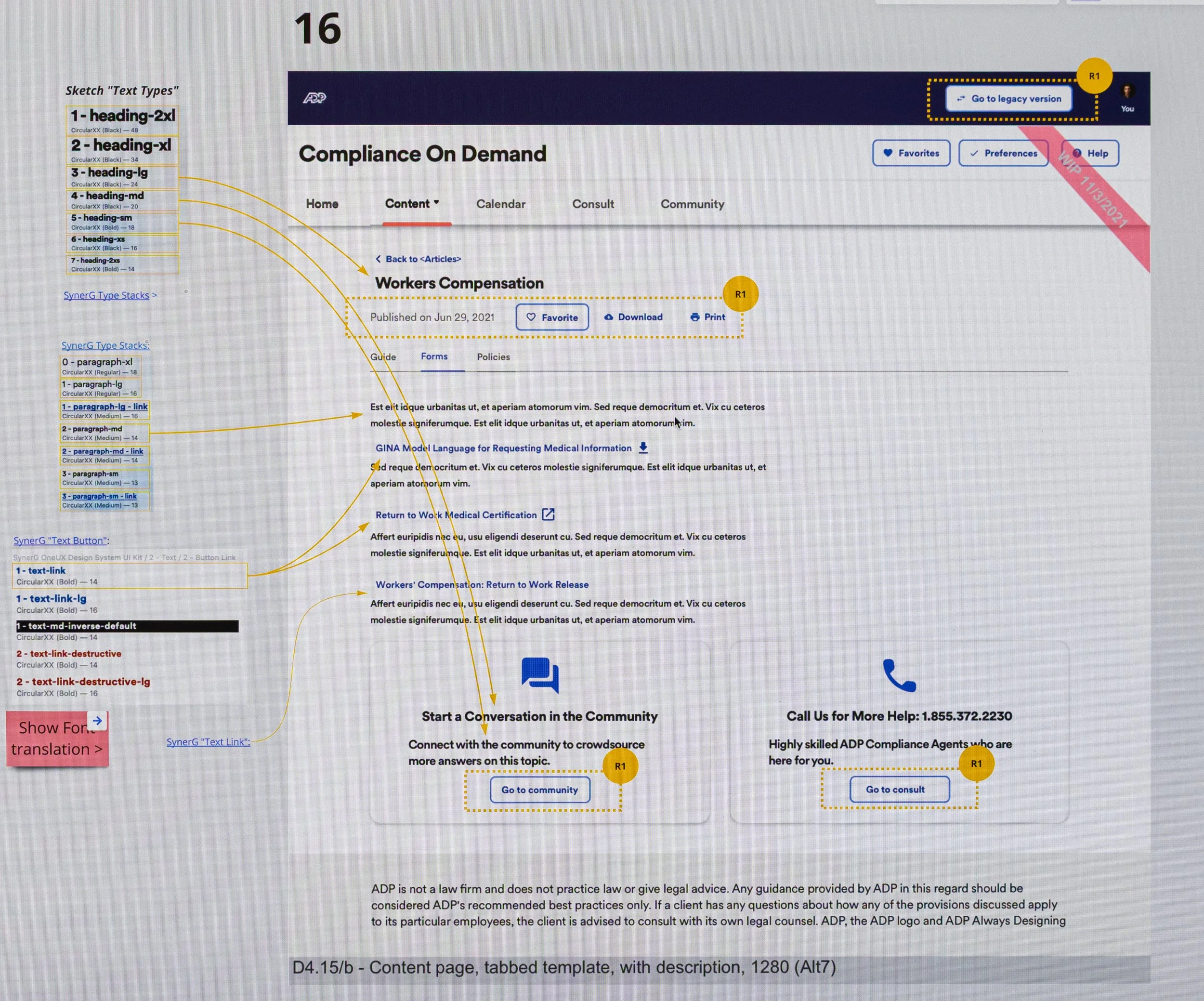
Below: Close-up of Flow for Help Pages: Using Heuristic #10 for “Help Documentation,” I found it in the current app and easy to access. However, the copy was outdated and unclear. Our product owner worked asynchronously on the new copy and pasted it into Miro for the developer and me to use later for updated comps.
Step 3: Iterate and Share Asynchronously
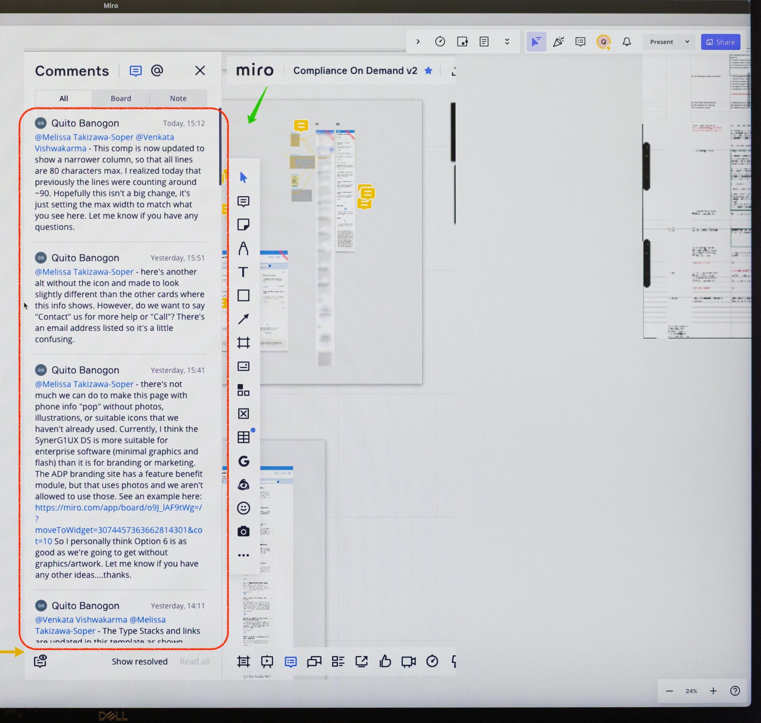
With the India-based developers 13 hours ahead, I collaborated more closely with my product owner, who was only 3 hours ahead. Since Zeplin wasn’t in use, I synced Sketch comps to Miro for handoff and asynchronous collaboration. I created screenflows and used the Miro comments to communicate with the triad team asynchronously every day.
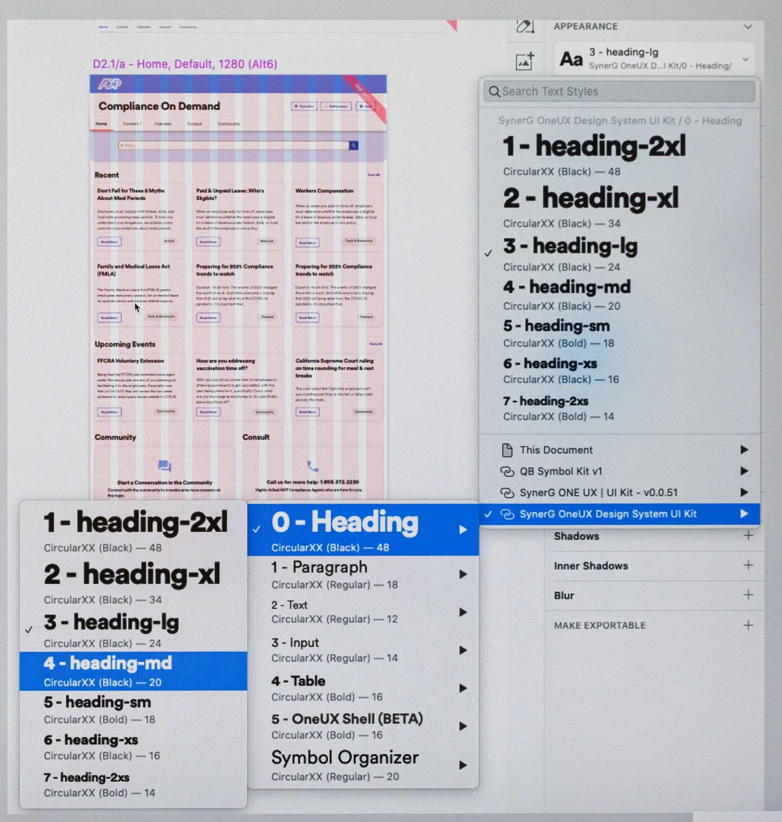
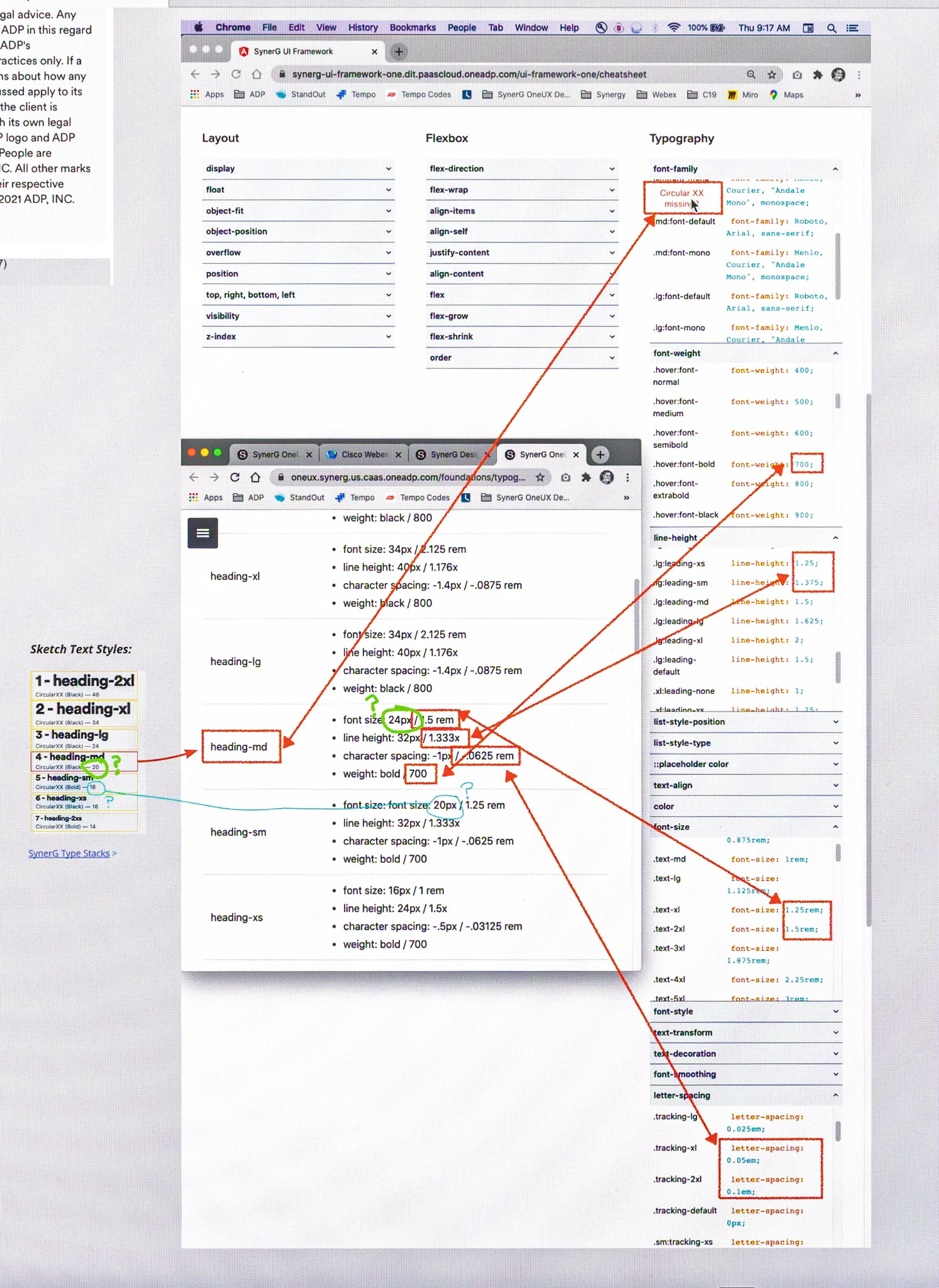
Step 4: Decipher Design System Fonts
The new OneUX design system team had just started creating the assets, and much of it was missing and still TBD. The font styles in Sketch weren’t aligned with the font attributes in the design system that developers used, and they needed font attributes in terms of “rem”. It caused much confusion when it came time to build. To overcome this, I met with the design system team to understand where the mismatch occurred. Then in Miro I mapped the Sketch font styles to the OneUX font attributes that used rem. This helped clarify how the developers in India should build so that it visually matched my Sketch comps.
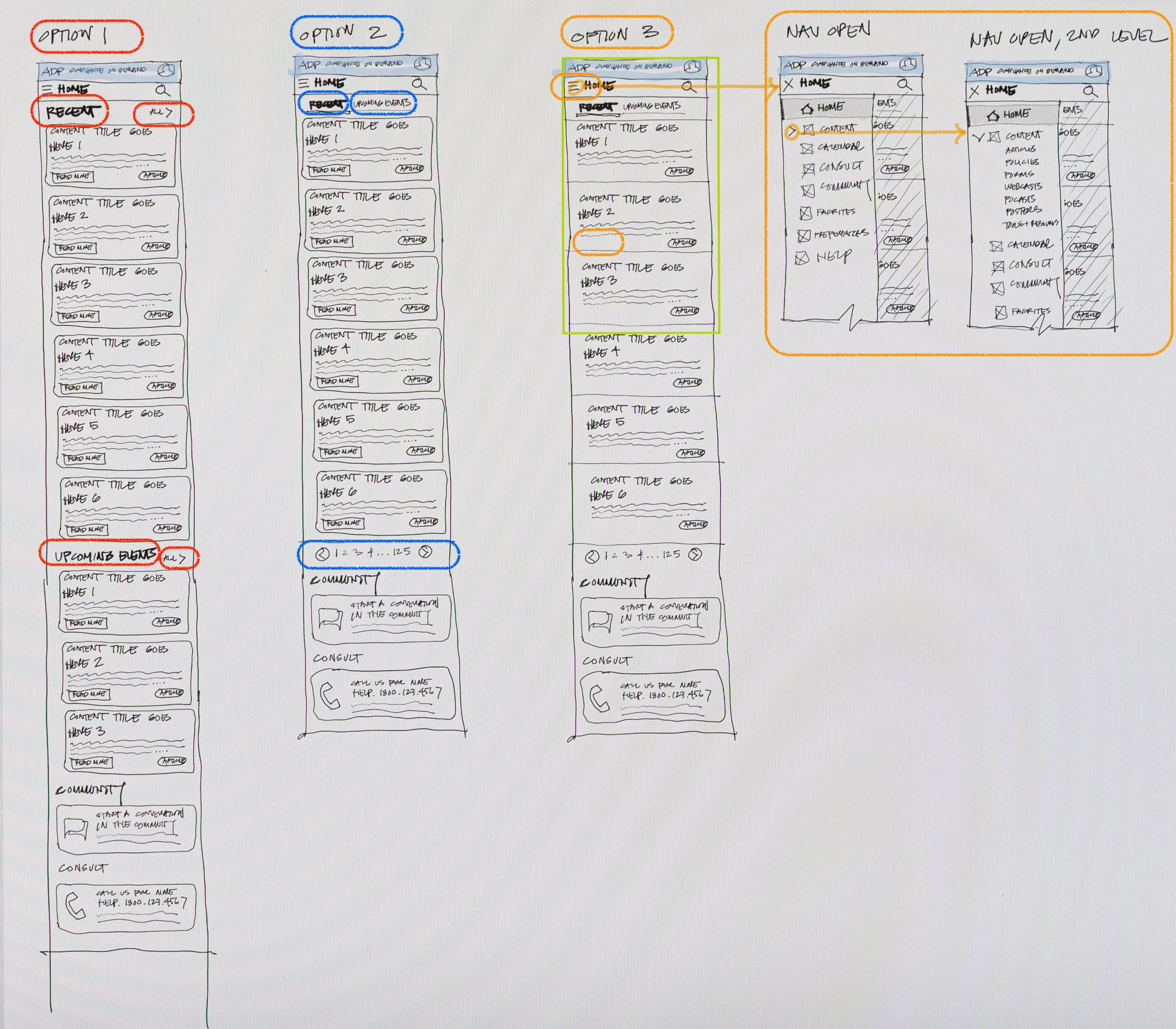
Step 5: Prototype When Necessary
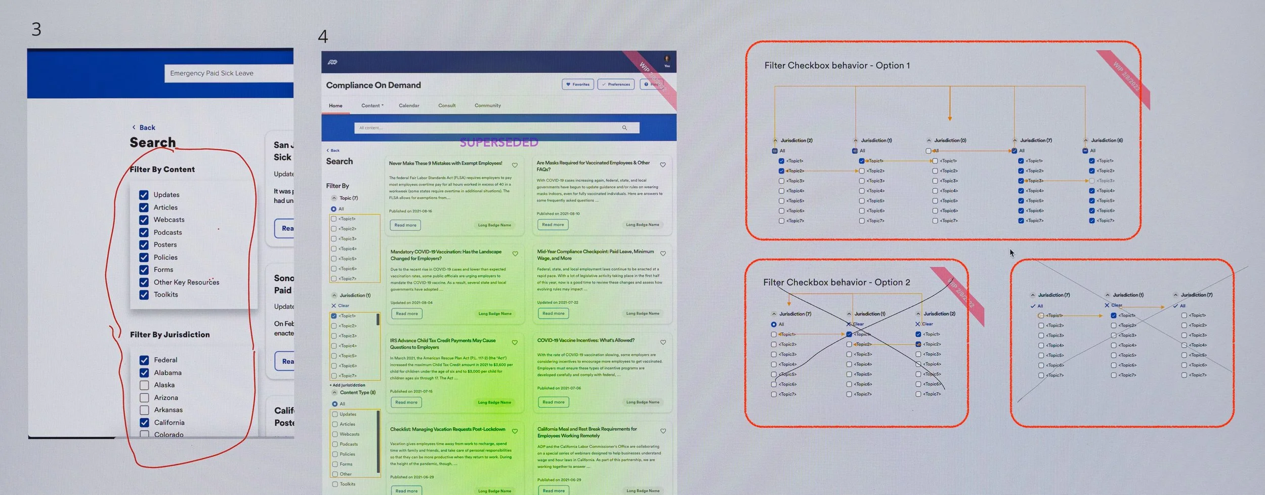
I enjoy prototyping because it brings concepts to life and makes design intent tangible for teams. With limited resources and time, we prioritized prototypes for screens that needed animation or flow clarity and I prototyped them in Axure. These communicated interaction behavior to development and prompted stakeholder feedback.
Step 6: Ensure Development Builds Match the Design
When teams aren’t co-located, especially across time zones, there are often misinterpretations in the design intent as developers try their best to fill in the gaps when they can’t directly communicate with the designer.
While the build was in QA, I setup a UX QA process and documented deviations in Miro. This enabled us to track them, and developers could asynchronously address them when they had bandwidth later.
The Result
Launched the MVP on time for the sales presentation.
Redesigned into a modern, CMS-driven Compliance on Demand aligned with ADP OneUX and Workforce Now.
Improved navigation and content structure, making it easier for HR to find and act on information and reducing manual support requests.
For the business, COD became a stronger sales tool: the redesign showed compliance readiness, boosted client confidence, and increased engagement and efficiency.
Impact Overview
Traffic to community site: 143.5% increase
Traffic to Littler site: 262.5% increase
Number of Consultations: 80.0% increase
Total Visitors: 54.2% increase
Total time on site: 13.4% decrease
*Decrease is better, because the HR Practitioner retrieved information faster, freeing them to do other things.
Using Pendo, we collected basic metrics that showed notable improvements summarized below.
Engagement
* Metrics for August were unavailable due to a Pendo tracking issue, but data from the prior months still showed clear improvements.
Traffic to Community Site
Traffic to Littler Site
Number of Consultations
Total Visitors
Time on Task
Total Time on Site
My Takeaway
I found it satisfying to successfully redesign and launch this B2B website from end-to-end. While I’d led similar projects before, this one challenged me in new ways, especially around design systems and remote collaboration. Here are a few things I learned:
Design Systems: Navigated ambiguous documentation by establishing strategic workarounds, ensuring UI consistency without slowing down delivery.
Typography Handoff: Bridged the design-to-engineering gap by standardizing rem-based font units, ensuring zero friction and functional accuracy during UI handoff.
Remote Collaboration: Devised an asynchronous operational framework, leveraging Miro and video documentation to successfully drive product launches across globally distributed teams.
< Home